

TYPOGRAPHY DO’S AND DON’TS
When talking about art in any form it’s strange to say that there are things you should and should not do. If something is beautiful to someone, regardless of how bizarre it is, then it is considered art.
Typography is a rare art form that does not get that privilege. With typography if you “do it” wrong, it will simply just be unsuccessful and/or illegible. – Alex Mysels, Creative Director and Senior Designer
Here are some typography tips that will change your life and give you so much knowledge that you will be empowered to be the best version of yourself every day.
Tip # 1
You should not use more than 3 fonts in your design piece.
Now there is a big difference between display fonts and text fonts – you cannot use more than one display font in your piece, but you can use more than one text font in your piece.
A display font is a font that is showy or unique in some way. Whether it be textured or patterned – its design stands out and is typically the focus of your piece. These types of font attract your eyes and say “look at me” just like a blinking neon sign. That’s why you shouldn’t use more than one, it will take away from the message you are trying to convey.
Here are two examples of display fonts:
Text fonts on the other hand are simple fonts that don’t necessarily jump out at you, but are great for longer copy that needs to look clean and legible. That being said, limiting yourself to two or three is just good design.
Tip #2
Always have a hierarchy of text in your design pieces.
Make sure your headlines stand out from your subheads and that your subheads differ in size from your body copy. Likewise, don’t be afraid to use weight, color, or all caps vs. sentence case to help establish this hierarchy!
One rule of thumb though, is under no circumstances should you stretch or warp typography – it just looks bad. If you need an interesting font check out any of the hundreds of type foundries online.
Now that you know some basics about fonts and where to download them, you might notice that a lot of fonts have the words “sans” and “serif” included in their names.
What does that even mean?
Tip #3
Use “serif” fonts in work with lots of copy and “sans serif” fonts when you need a more modern look.
“Sans” is Latin for without – which means it doesn’t have “that thing” (whatever that “thing” may be).
Here… we drew the “thing”.
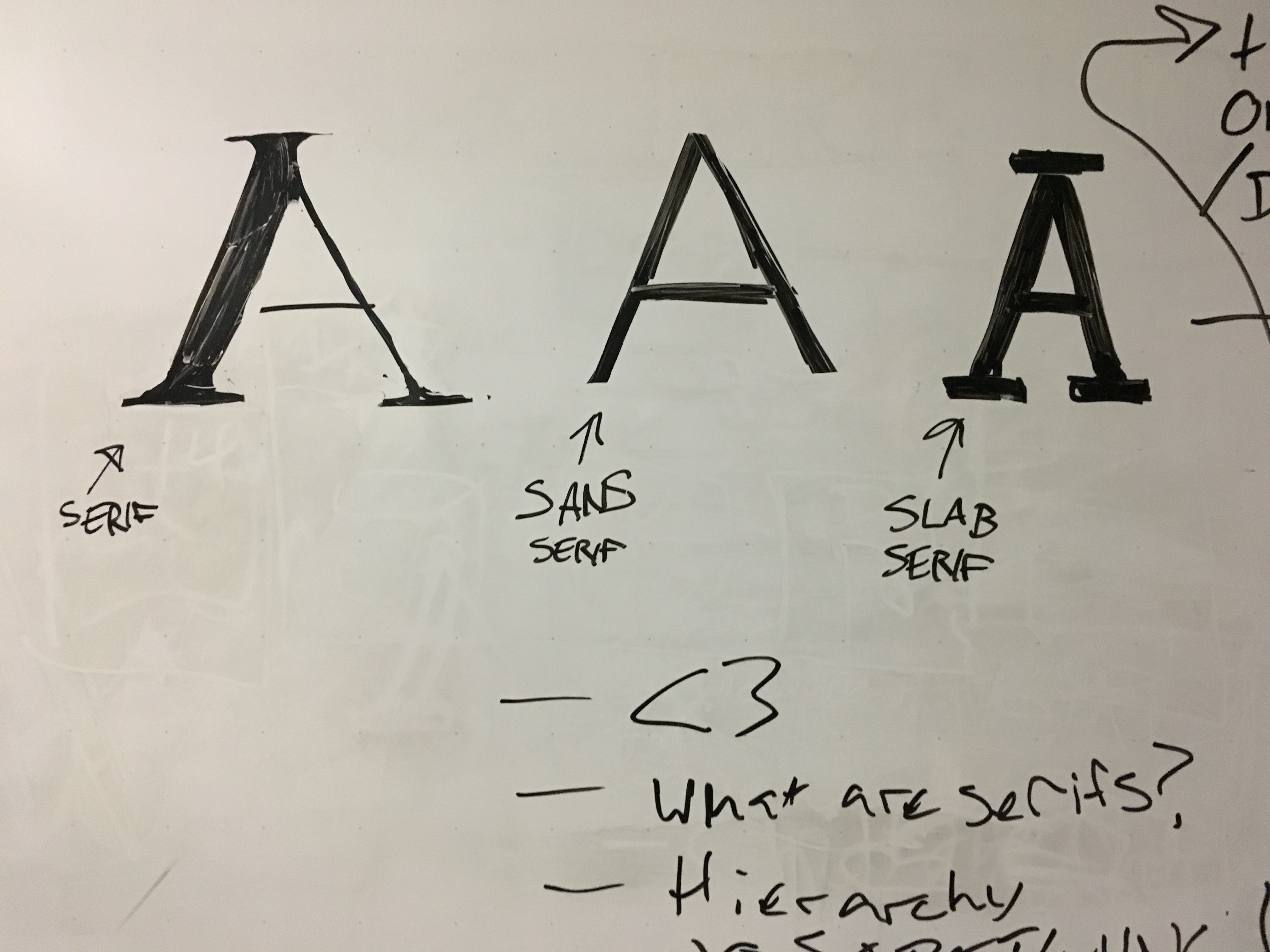
See what we mean? Those edges at the end of the letters serve a purpose – they’re meant to lead your eyes to the next word. Having those little doilies (was looking for an excuse to use the word doily for about 6 months now) at the edges of your letters help lead your eyes in print, but they aren’t as necessary online.
Tip #4
Point size should be between 8 to 12 points in print, and between 14-24 pixels on the web.
This is pretty self-explanatory but a point worth addressing here is capital letters and the difference between manual small caps and real small caps.
Manual small caps occur when you are using a font that does not have a built-in small caps style – so you have to do it yourself. When you do this manually the first letter is thicker than the rest and it looks strange. Real small caps is when the whole font is designed so that the weight of each letter is consistent throughout.
Here… look:
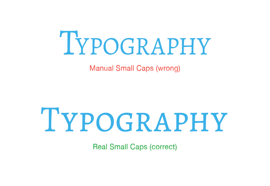
Do you see how in the first example the “T” is a lot thicker and it looks strange? That is manual small caps at its finest. Just don’t do it.
Tip #5
Light fonts work best on light backgrounds and in negative space, whereas heavy fonts work better on images or darker colors.

*Quick tip – negative space is not empty space. You should use negative space to give your text some breathing room.
Tip #6
Always use fonts that are appropriate to your message.
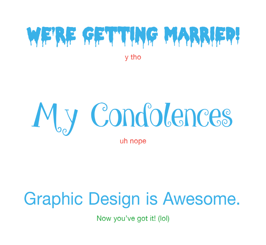
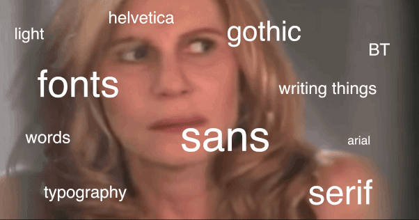
We know that sometimes fonts can be overwhelming and confusing because there are so many. But do not get overwhelmed – trust your vision and pick fonts that make sense for your piece and compliment your creative vision.
In other words, don’t be like the confused meme lady. It will be ok. We believe in you.
More Blogs
412 Day
To honor this year’s 412 Day, a day dedicated to honoring all things Pittsburgh, the Blink crew shared what defines the heart and soul of the vibrant metropolis most of us Blinkers call home. From...
A Blinker’s perspective on this year’s Super Bowl ads
-Mark Dello Stritto, Vice President of Creative My team asked me to share my thoughts about this year’s Super Bowl spots. I obliged, of course, but discussing Super Bowl ads has always been a little...
Mark Fallone – The English Sheep Dog – Servant Leader – Scallop Chef
Karlee Reynolds – Digital Marketing Strategist at Blink Mark and I sat down to discuss his new role as VP of Production at Blink. He gives us a look into how the industry and his...
